The challenge on Less is More´s blog this week is a color challenge!
Predominantly Black!
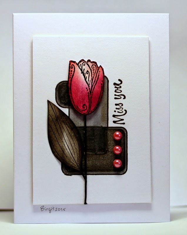
"Your whole card doesn't have to be all black and you may use a little of another colour, but whatever you add to your design, even if it's minimal, should be mainly black."
My card with the sweet Tulip from Serendipity Stamps


11 kommentarer:
You cards always amaze me, this one is fabulous
Kathyk
Absolutely stunning as always Birgit. Nothing fazes you and I love the little pops of red. Thanks as always for playing along at less is more.
Sarah x
Just stunning Birgit, the touch of red is perfect!
Thanks so much
Chrissie
"Less is More"
Very striking card!
Using a lot of black could makeit very dsrk and gloomy but the red tulip and the pretty red gems against the white background is stunning Birgit. x
I absolutely love everything you create. Your color choices are always exceptional. This card is no exception! Thanks for sharing...
Birgit what a very striking and stylish card - as ever!
Thanks for joining us at Less is More this week
Anne
Less is More
A very beautiful card, Birgit :)
Stunning card, love it. Karen x
Stunningly stylish card!
Elaine
A gorgeous card.
Skicka en kommentar