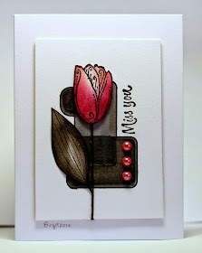
The challenge on Less is More´s blog this week is a color challenge!
Predominantly Black!
"Your whole card doesn't have to be all black and you may use a little of another colour, but whatever you add to your design, even if it's minimal, should be mainly black."
My card with the sweet Tulip from Serendipity Stamps


You cards always amaze me, this one is fabulous
SvaraRaderaKathyk
Absolutely stunning as always Birgit. Nothing fazes you and I love the little pops of red. Thanks as always for playing along at less is more.
SvaraRaderaSarah x
Just stunning Birgit, the touch of red is perfect!
SvaraRaderaThanks so much
Chrissie
"Less is More"
Very striking card!
SvaraRaderaUsing a lot of black could makeit very dsrk and gloomy but the red tulip and the pretty red gems against the white background is stunning Birgit. x
SvaraRaderaI absolutely love everything you create. Your color choices are always exceptional. This card is no exception! Thanks for sharing...
SvaraRaderaBirgit what a very striking and stylish card - as ever!
SvaraRaderaThanks for joining us at Less is More this week
Anne
Less is More
A very beautiful card, Birgit :)
SvaraRaderaStunning card, love it. Karen x
SvaraRaderaStunningly stylish card!
SvaraRaderaElaine
A gorgeous card.
SvaraRadera